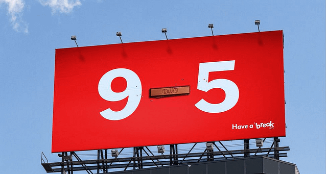


KitKat has unveiled a minimalist yet highly effective new campaign that turns a common punctuation mark into a powerful brand asset. Developed by the creative agency Courage, the campaign takes the humble dash (—)—a symbol seen millions of times daily—and replaces it with the iconic KitKat bar to remind consumers that the space between tasks is the perfect time for a break.
The Creative Concept: The Space Between
The campaign leans into the long-standing “Have a break, have a KitKat” platform by identifying the dash as a visual representation of a pause. By placing a KitKat bar in the middle of familiar pairings, the brand highlights the transitions in our daily lives.
- Familiar Contexts: The creative features pairings like 9—5 (work hours), YYZ—JFK (flight routes), and other everyday spans where the dash connects two points.
- Minimalist Execution: There are no lengthy slogans or complex visuals. The KitKat-shaped dash does all the heavy lifting, acting as a subtle yet unmistakable prompt to pause.
- The “Plain Sight” Insight: Joel Holtby, Co-Chief Creative Officer at Courage, explains that the dash represents the “space between two things,” which perfectly aligns with KitKat’s brand DNA.
Media Strategy & Rollout
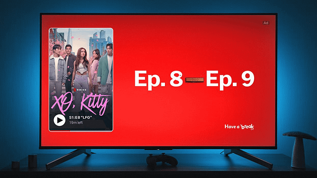
Nestlé Canada is launching the campaign across a diverse mix of high-traffic and high-engagement platforms to ensure the “dash” is seen in context.
- OOH & DOOH: Strategic placements in transit hubs and urban centers where people are moving between locations (e.g., commuting from home—work).
- Streaming & Social: The campaign will appear on platforms like Netflix, as well as across social and digital channels, catching users in their leisure “breaks.”
- Cross-Category Appeal: The imagery spans various sectors, including sports, travel, and professional life, making the message universally applicable.
Campaign Fact Sheet
| Category | Details |
|---|---|
| Brand | KitKat (Nestlé Canada) |
| Creative Agency | Courage |
| Concept | Reimagining the “dash” as a KitKat bar |
| Tagline | Have a break, have a KitKat |
| Media Mix | OOH, DOOH, Social, Digital, Streaming (Netflix) |
Industry Significance
For marketing and advertising professionals, this KitKat campaign is a masterclass in “Distinctive Brand Assets.” It demonstrates how a brand can “own” a piece of everyday visual culture without needing a logo or a loud message. By claiming a symbol as simple as a dash, KitKat ensures that even when consumers aren’t looking at an ad, the world around them becomes a constant, subtle reminder of the brand. This minimalist approach is a growing trend in OOH, where simplicity often yields the highest recall.